

HOMEPAGE & CHANNEL UX
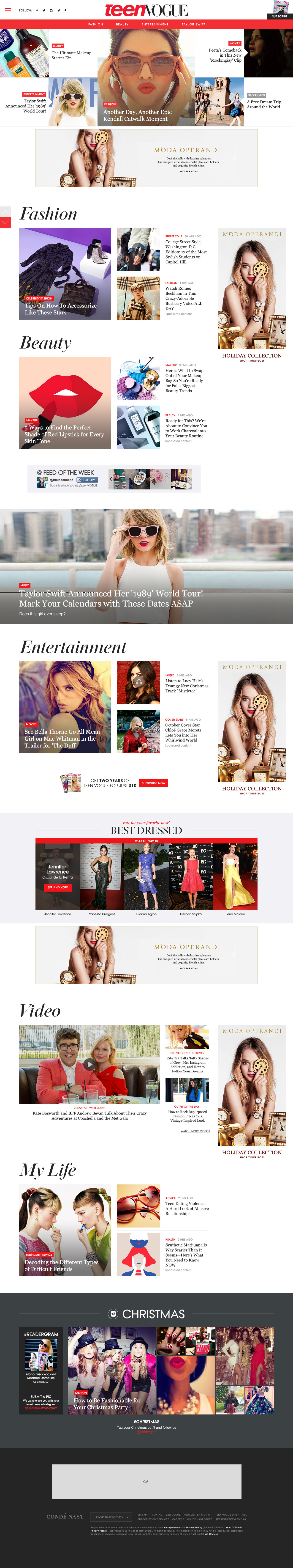
TeenVogue.com Redesign
As the magazine delivering emerging fashion, beauty and pop culture for teenagers, Teen Vogue has 7.6 million audiences from print and digital. The redesign of teenvogue.com aims at representing the younger generation's voice and emphasizing Teen Vogue's authentic content.
Date: 2014
UX Design: Yanwen Hu
Visual Design: Sylvia Park
Skills:
Information Architecture: Site structure, Data Analysis, Content Mapping User Experience Design: User Flow, Wireframe
- Homepage -
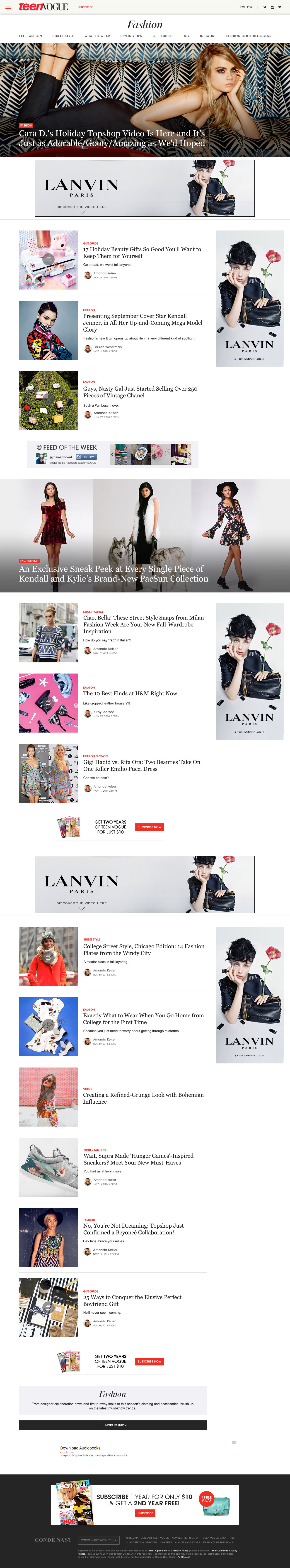
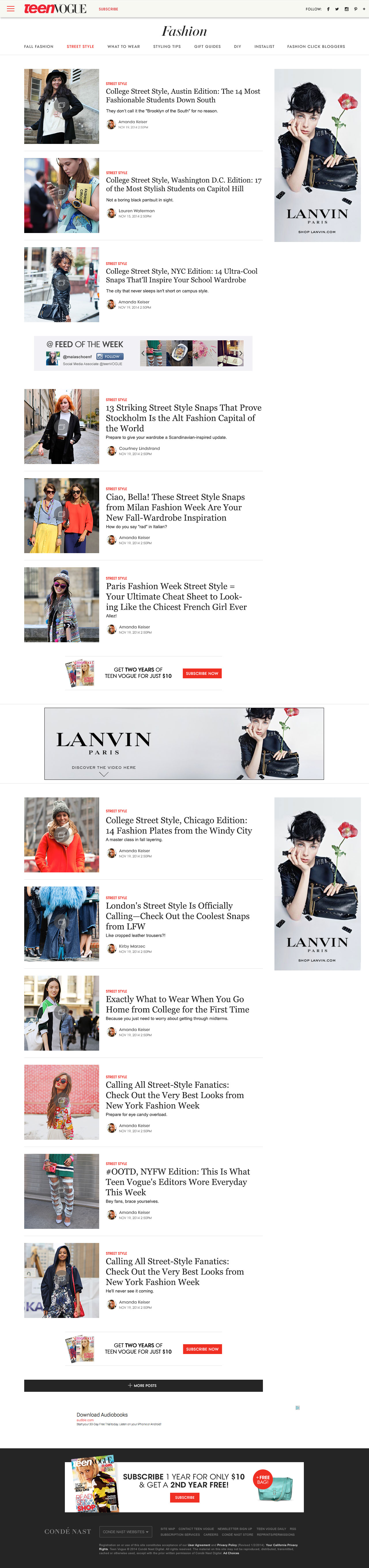
- Channel -
- Mobile -
Process
Project Team: 1 Design Lead, 1 UX Designer and 1 Visual Designer
As UX designer in Teen Vogue redesign team, in charge of the UX process of site structure and template redesign
1. Data Analysis
Page views and unique visitors: homepage traffic was lower compared to the whole site, but slightly higher than other brands' homepage. Channel/subchannel traffic was the lowest (around 0.5%)
High value audiences: among all the visitors, high value users frequently visited Teen Vogue homepage on both desktop and mobile
Mobile traffic: in general, the mobile index page traffic was lower than the desktop's
2. Content Analysis
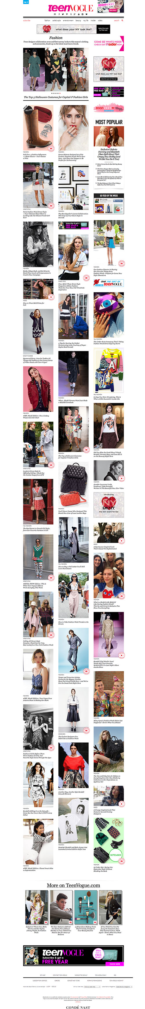
PROBLEMS
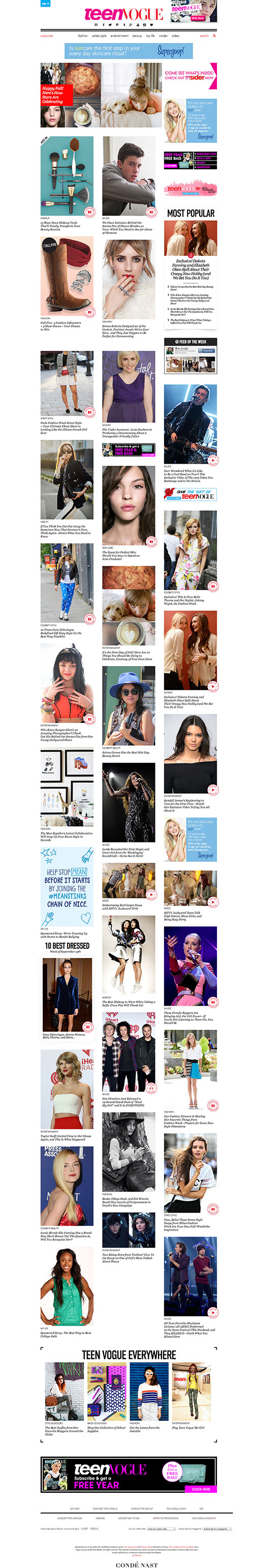
Overwhelming mosaic layout: posts on the index pages were less organized and visually unsorted
Not called out channels: there was no module featuring channels on homepage
No curated content: there were no flexibilities for the brand to promote any editor's picks content on the index pages (e.g. Best Dresses, Video, Instagram)
3. Site Structure
PROBLEMS
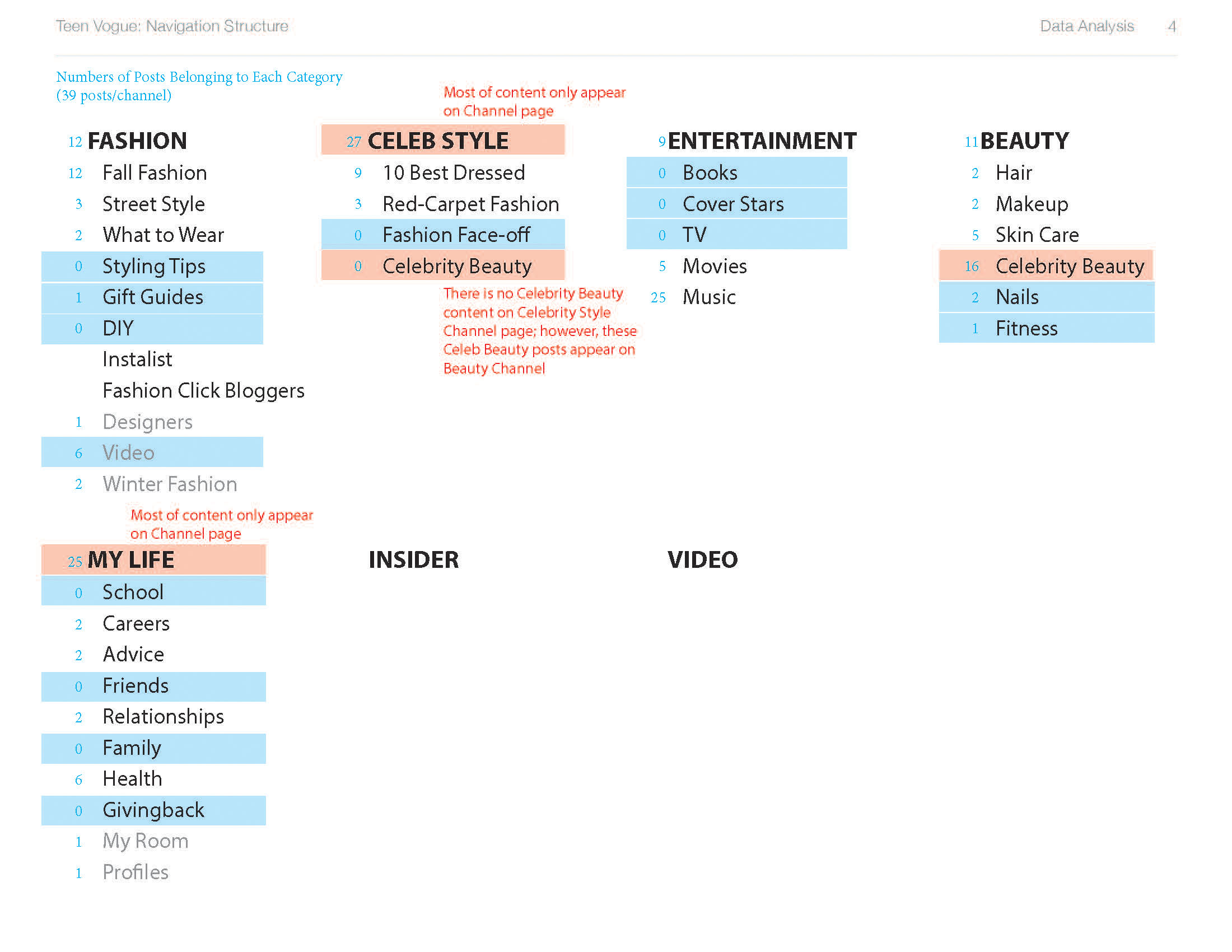
Content Taxonomy:
Some posts belonged to channels, but they did not appear on any subchannels
Some index pages were not covered in the site structure, like Designers (Fashion) and My Room (My Life)
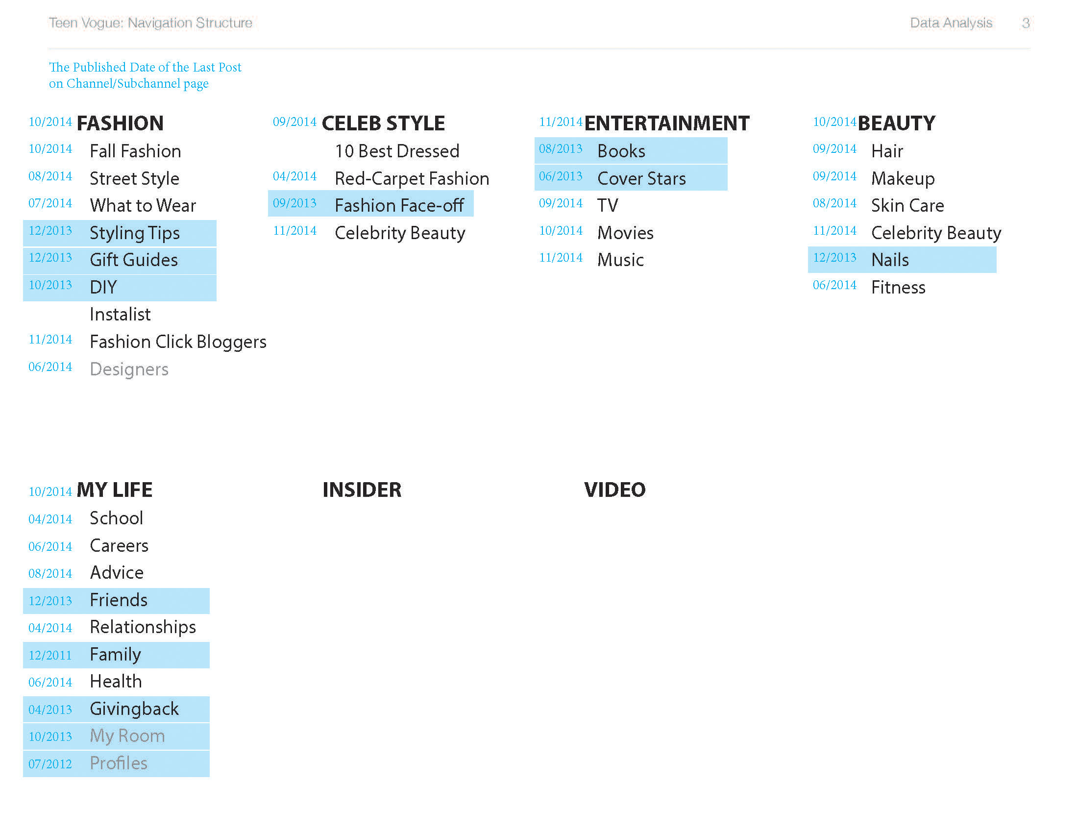
Update Frequency:
A few Sub-channels had not been updated in months, and still showed last year's posts
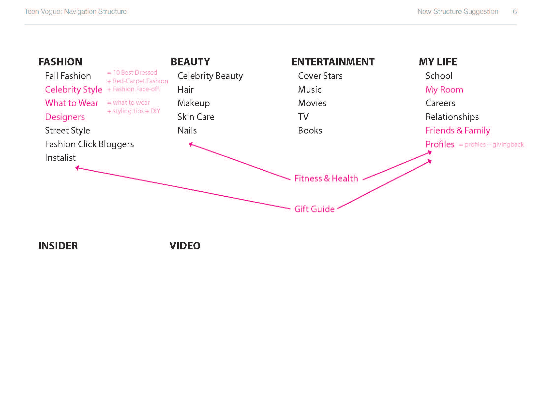
4. New Structure
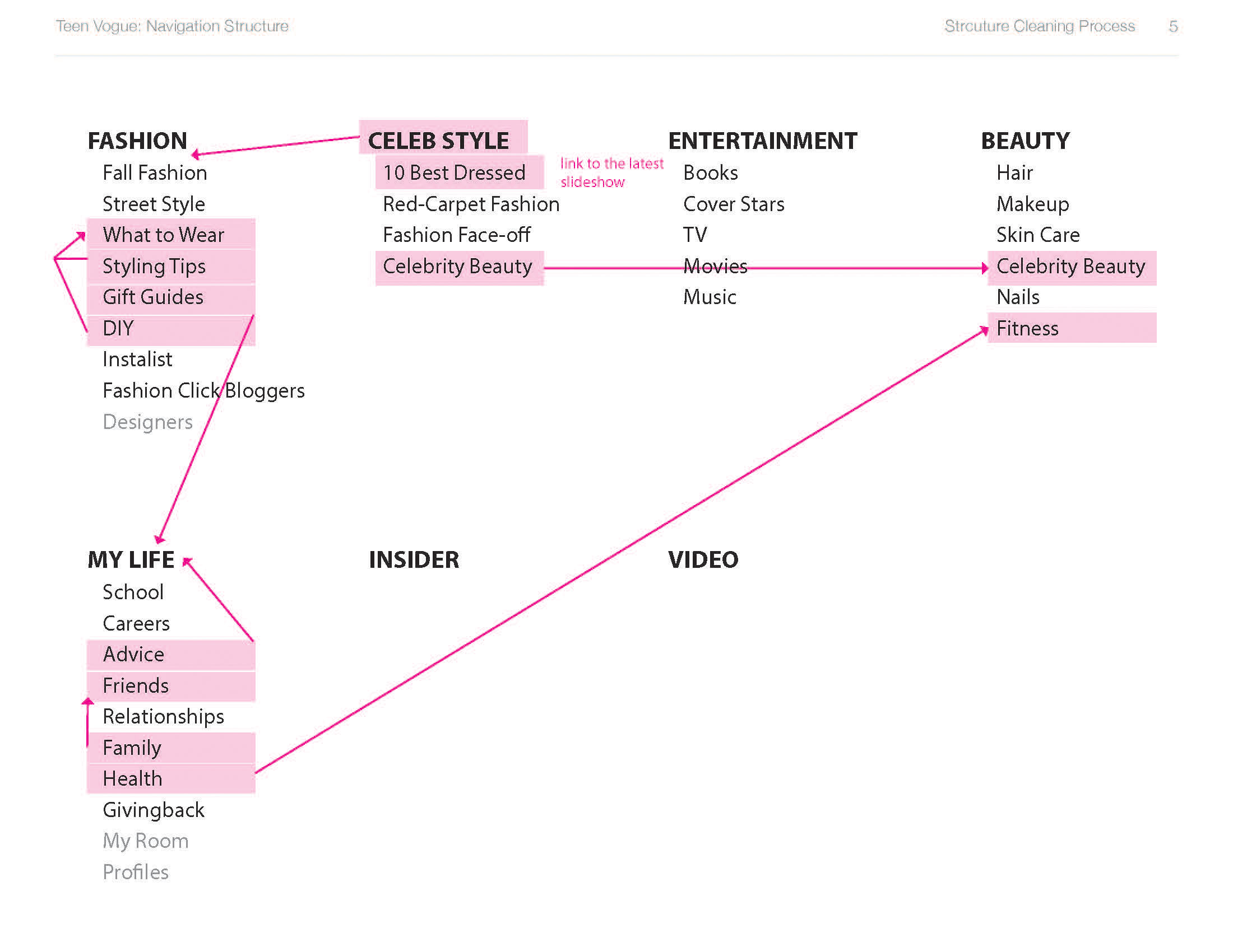
Content Logics:
Arranged index pages based on update frequency, page views and editorial strategies
Took out redundant index pages, and added back the missing index pages
Combined similar subchannels
5. Wireframes
Starting from paper sketch, narrowed down the concepts to two directions:
One focuses on the feed of content, which is more fresh and dynamic
Another one packages content based on channels, which has more flexibilities on the editorial curation


6. Visual Design
Closely collaborated with visual designers to transform wireframes to visual design
- More Related Projects -

CNT Redesign

Epicurious Profile

Glamour Oscar